Arsen Kolyba

Software designer
Currently at Wix

Hello, visitor ...

Researching, prototyping, designing and testing by day, coding, no-coding, launching products by night

R key pressed
arrow iconBack to tiles
Zori

Zori

Year

2023

My role

Research, Design

Team

Engineers, PM

See live

zori.app

What's been done

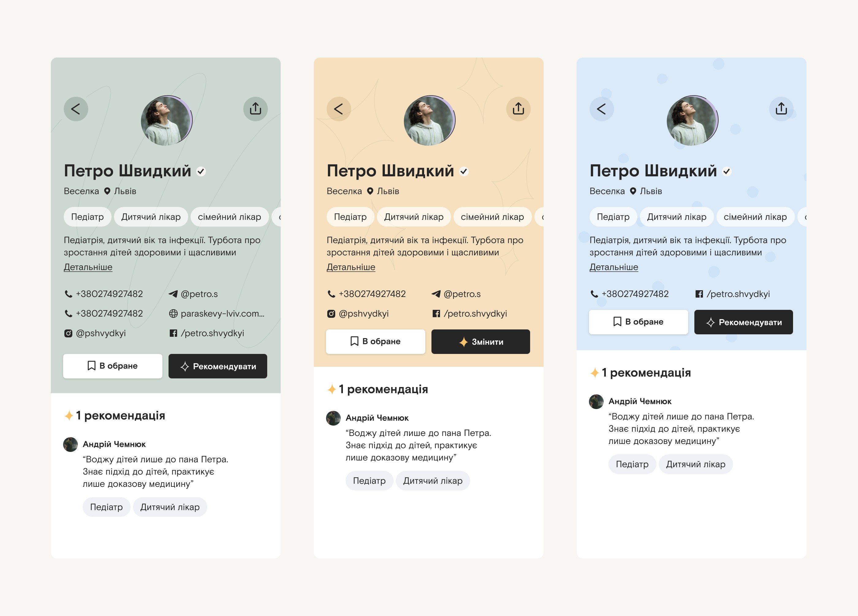
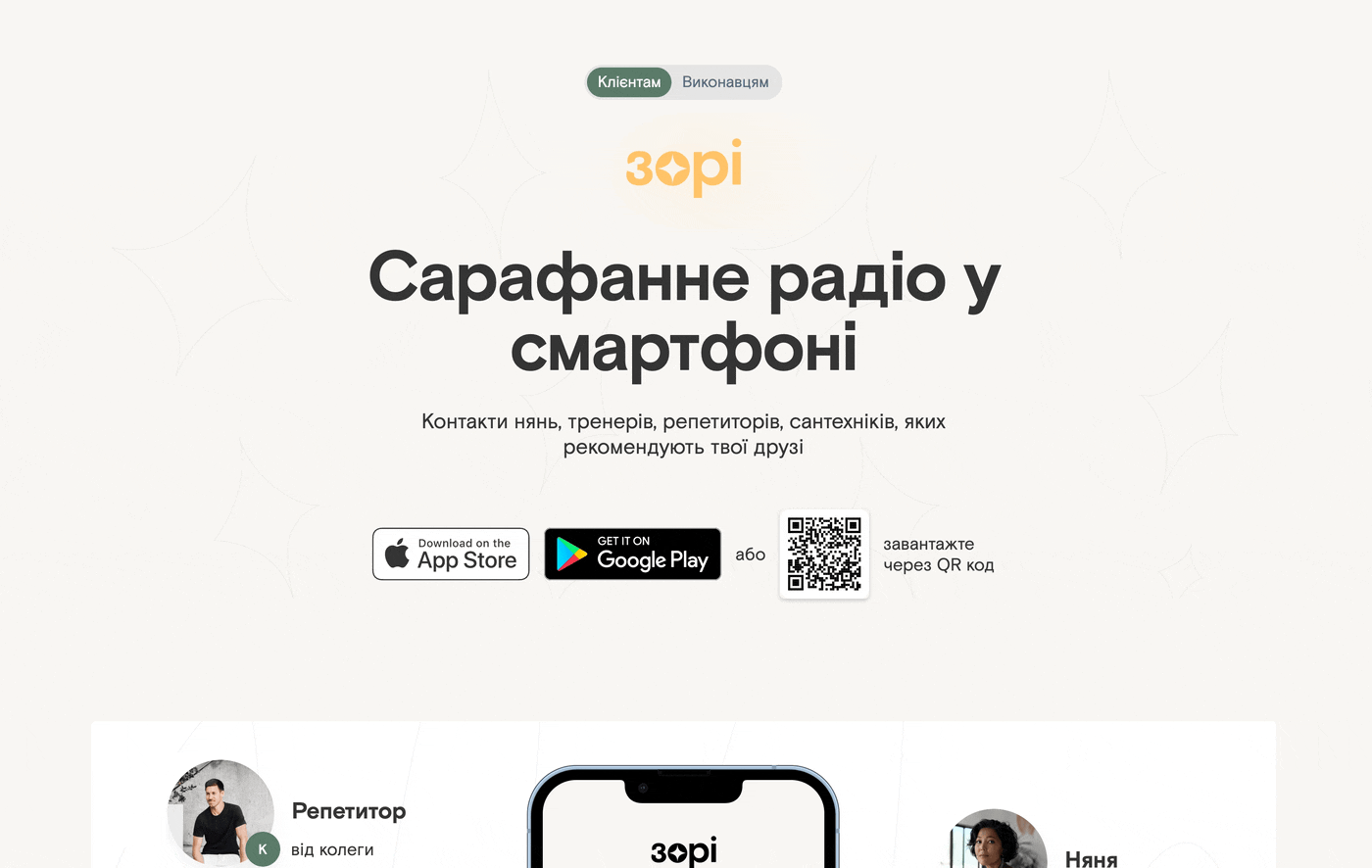
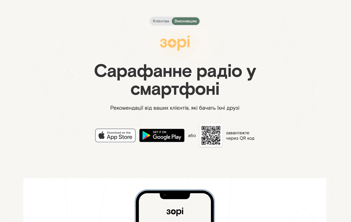
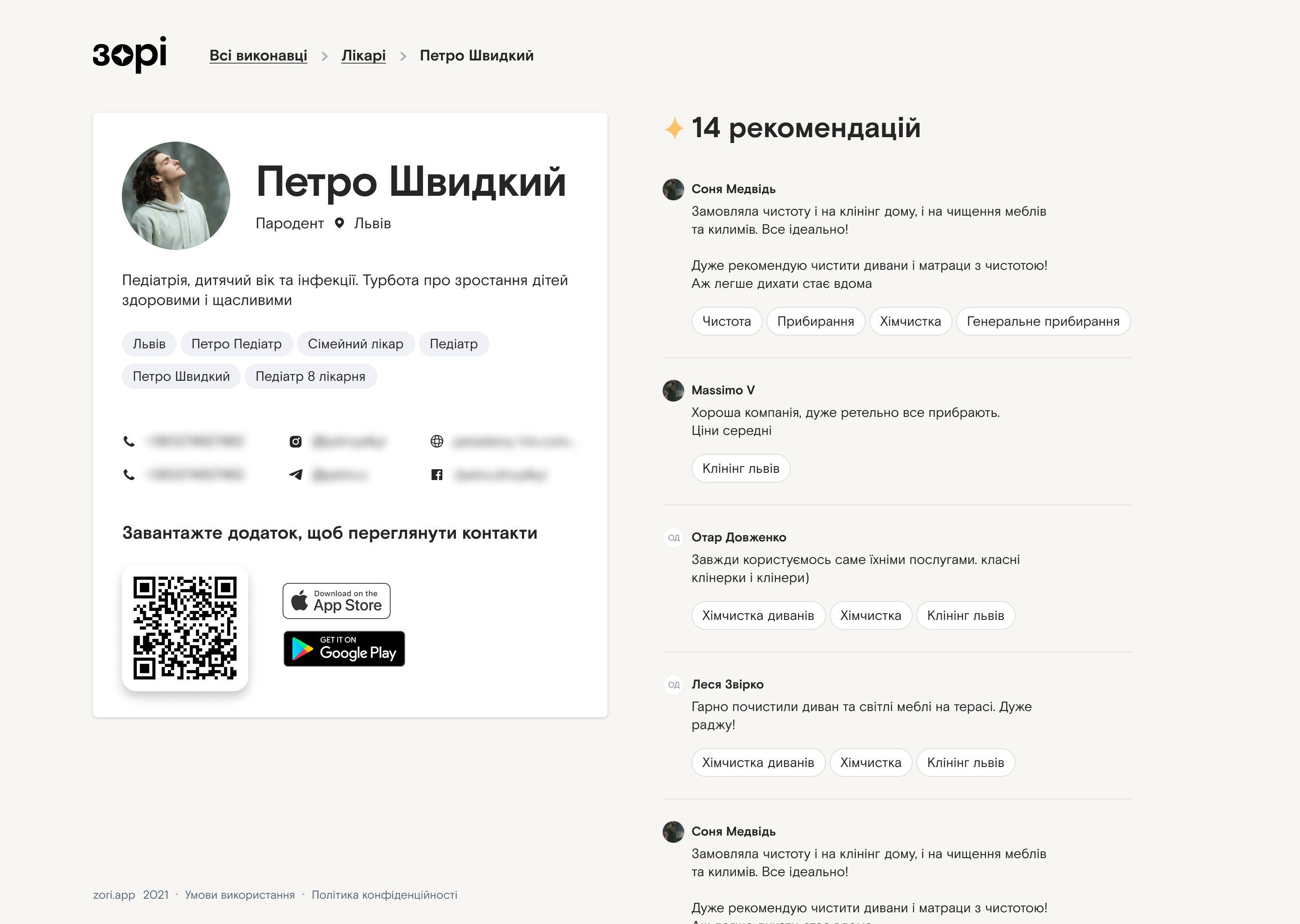
Created a foundational design system, designed an app for iOS and Android, created a few illustrations, designed the website and various marketing materials.

Context

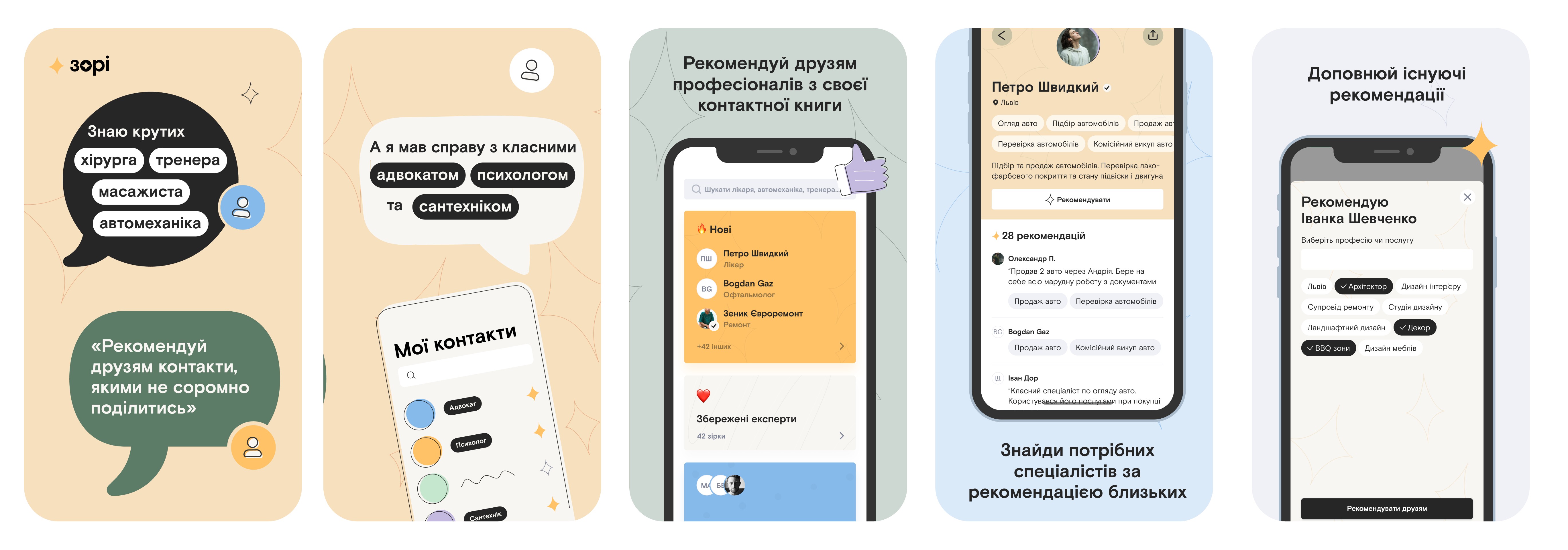
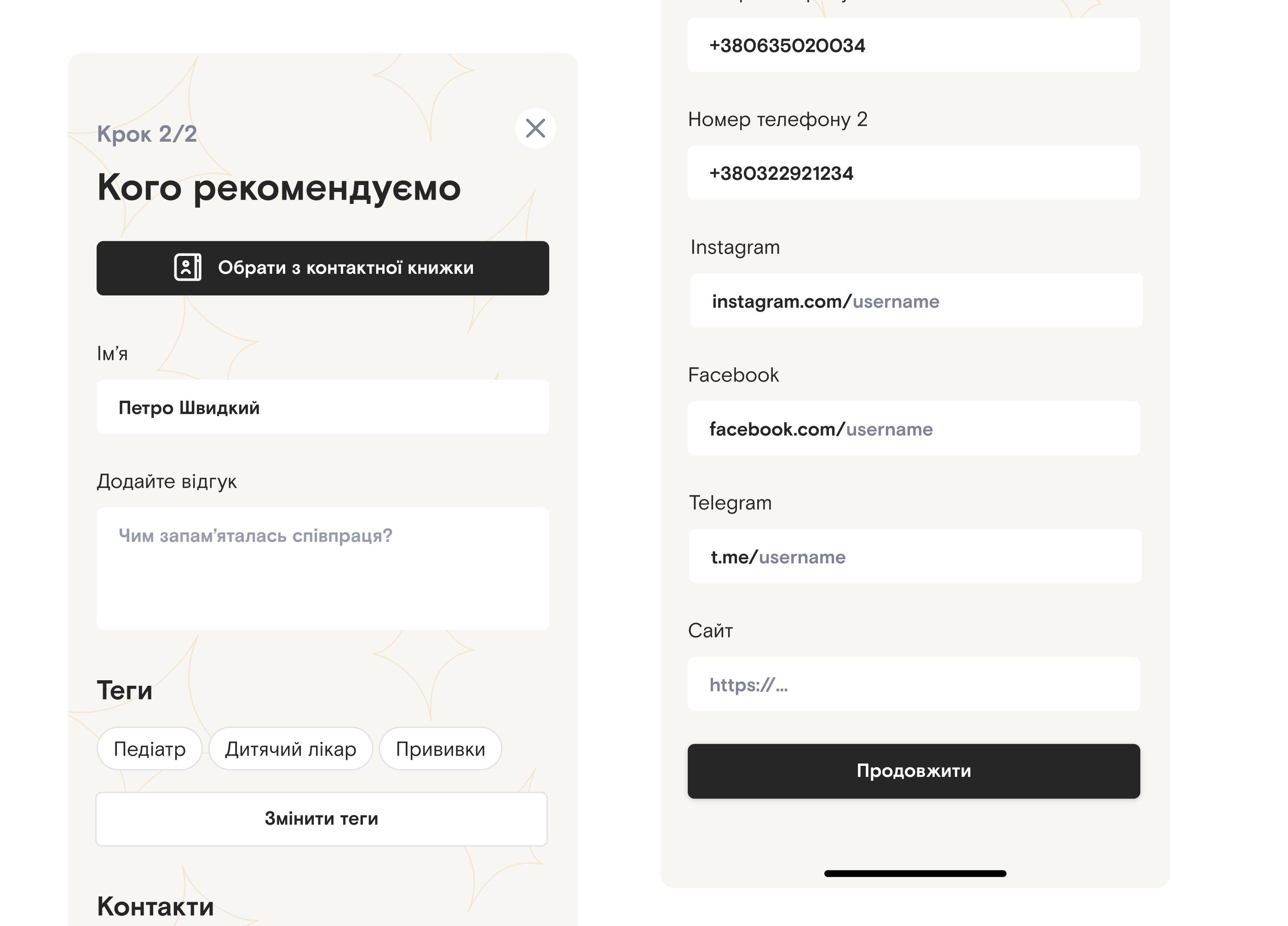
Zori (means 'stars' in Ukrainian) is a startup that I joined as designer at an early stage and designed everything from the ground up. The idea of the product is to digitilize word of mouth and bring recommendations of professionals in different fields that you'd ask for physically to an app.

The app is local and aimed at the Ukrainian market (at least for now), so everything you’ll see below is in Ukrainian language.

Star logo
The whole concept of the app, including the name, revolves around a star. We call people that get recommended stars, the action to recommend is a star, the app logo is a star, etc.
Splash screen animation
Splash screen that quickly explains what the app is about. The phone vibrates slightly on each animation to mimic notifications

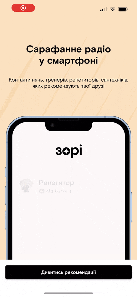
The whole idea of the app is to get recommendation of professionals from people you know. The splash screen shows that you got recommendations of a tutor from a collegue, nany from a friend, trainer from mom and a lawyer from another friend.

Home screen of the app
After logging in the first thning you see is the 'zori' tab.

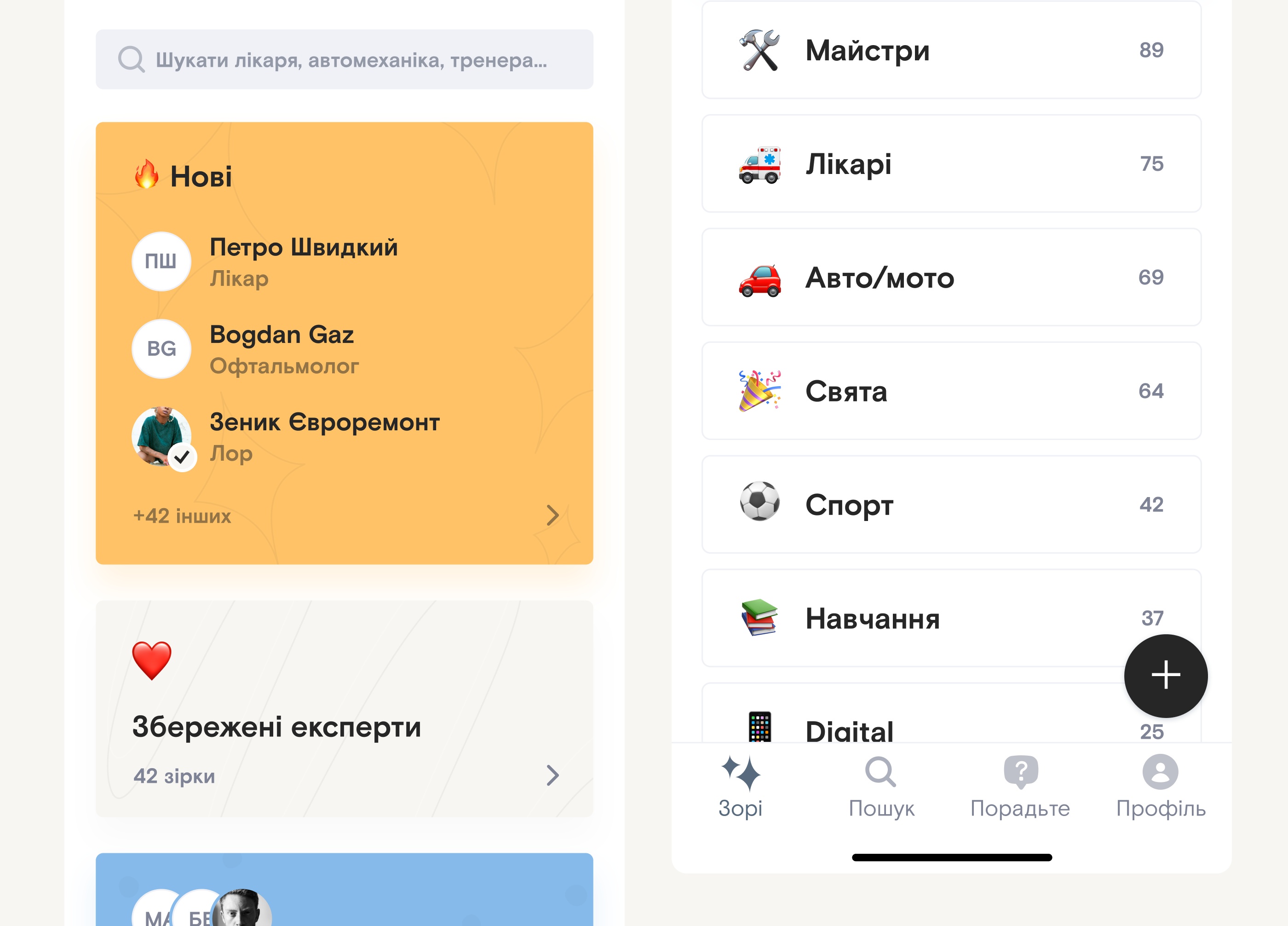
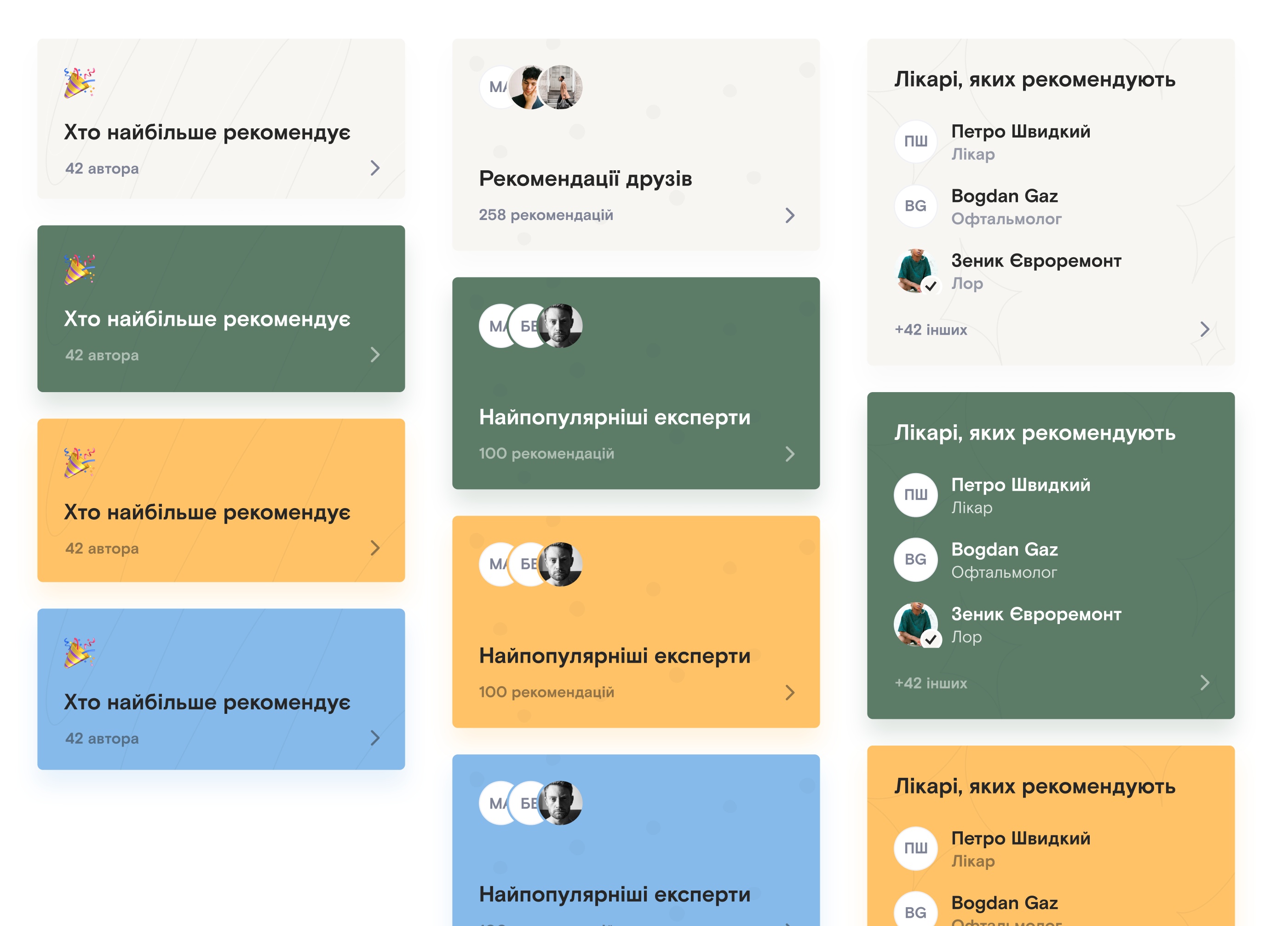
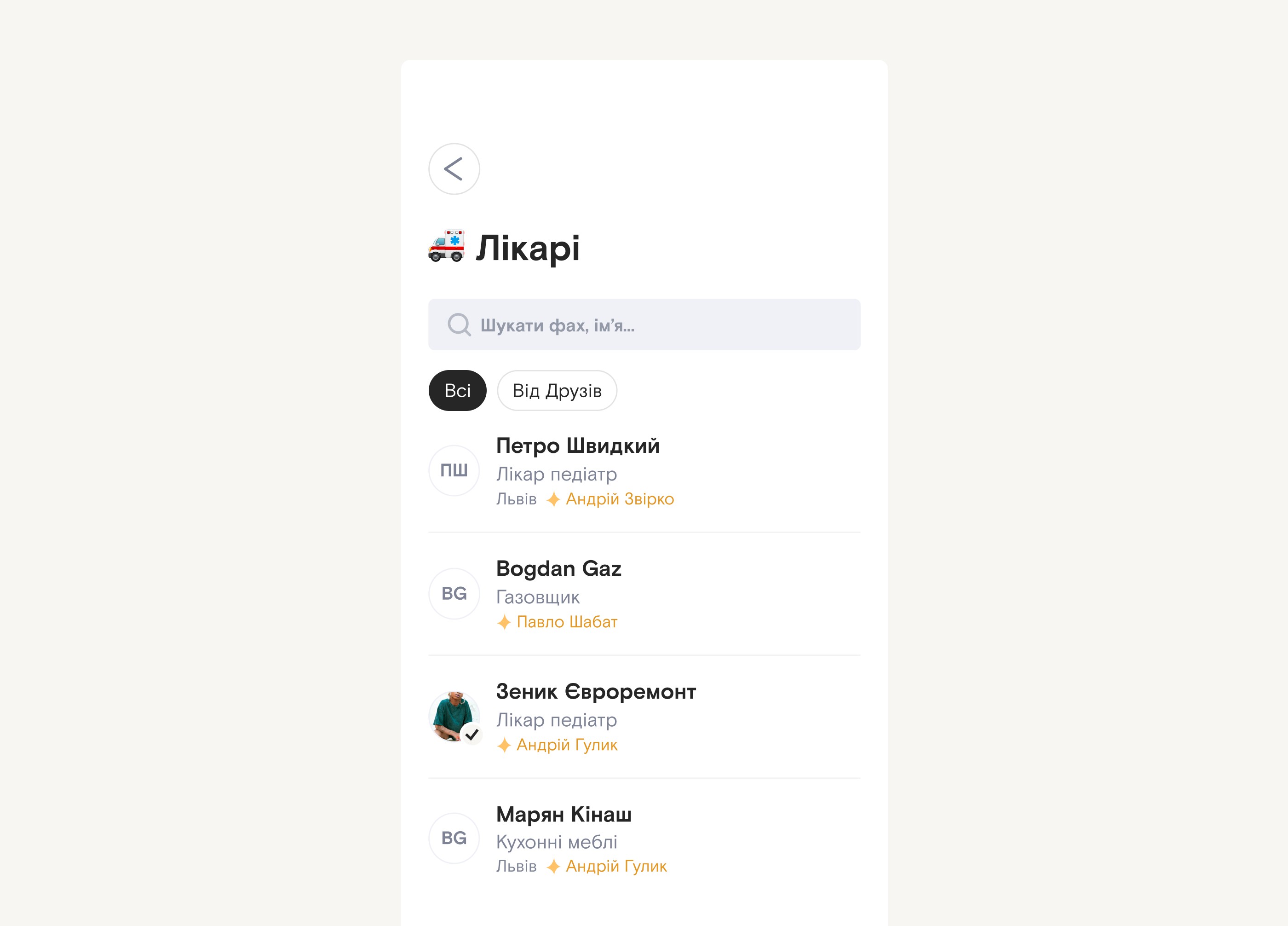
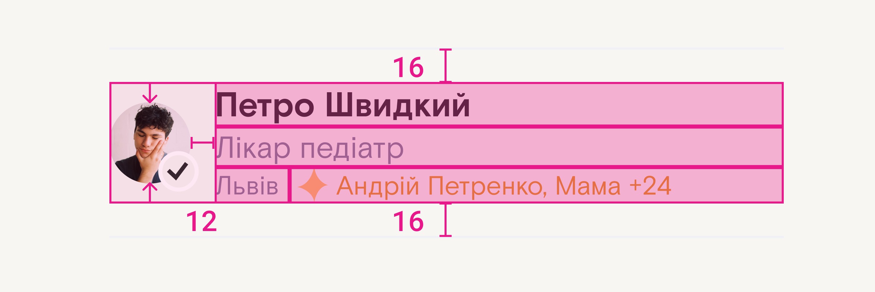
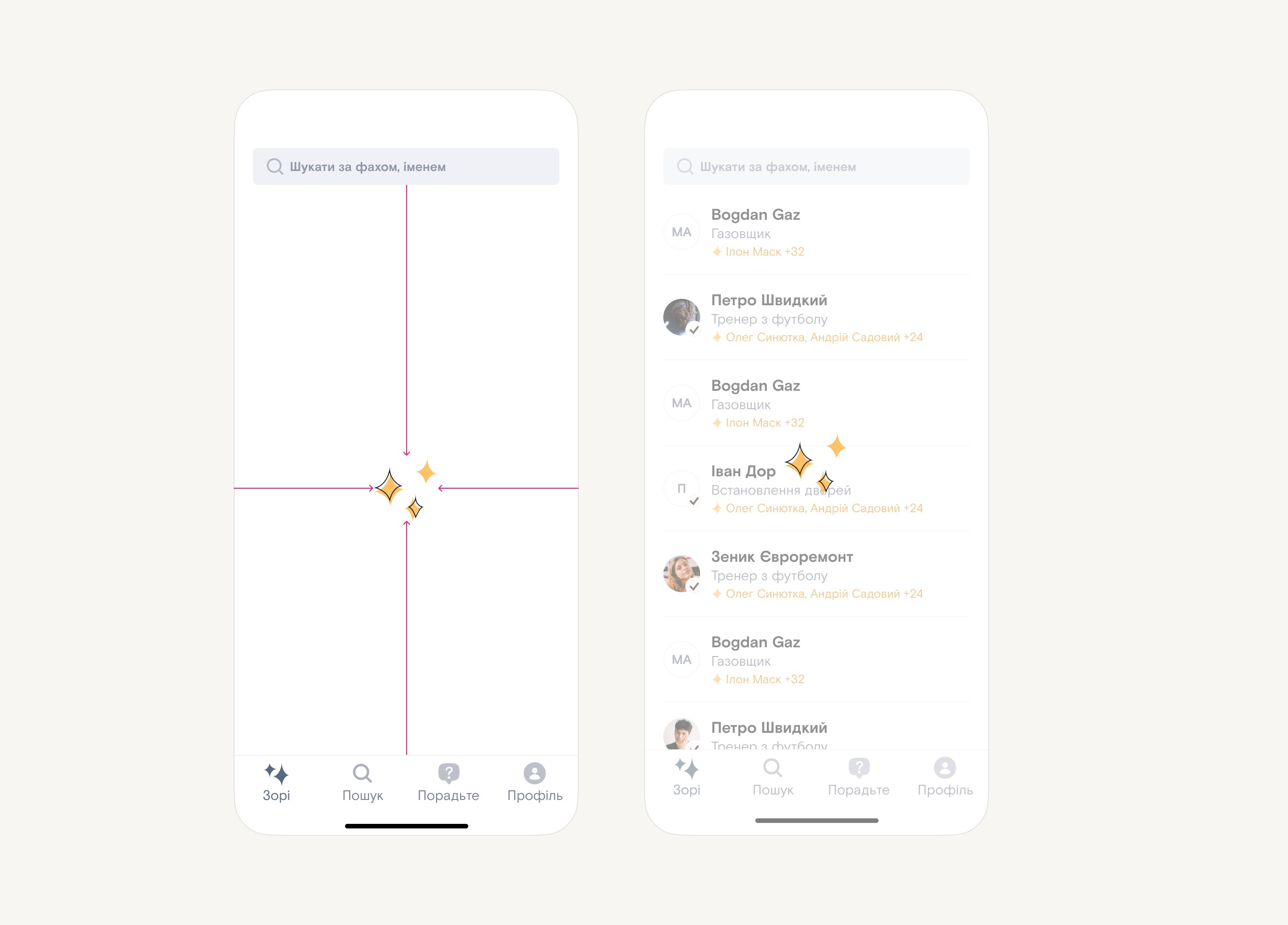
We’ve decided to go for a tile approach insipired by the app store. The screen features tiles like “New”, “Saved” and tiles from influencers – their own collections of recommendations. At the end of the screen you can see the list of categories and filter by that.

Types of tiles on the home screen
Tiles are not managed by me, so I created multiple variations that the team can pick and choose from. There are different sizes and colors/pattern combos.
List of recommendation
Opening any tile, category or other list will eventually bring you to the list of recommendations, arguably the most important screen in the app.
Anatomy of a list item
Anatomy of the recommendation inside of a list
Star profiles
Profiles of the stars have variation to them
Recommendation flow
The whole concept of recommendation is based on contacts and tag. You either select a contact from your list or enter manually and then add tags for this person.
Recommendation preview
After that you see a preview with the data you've already entered and some that you could add

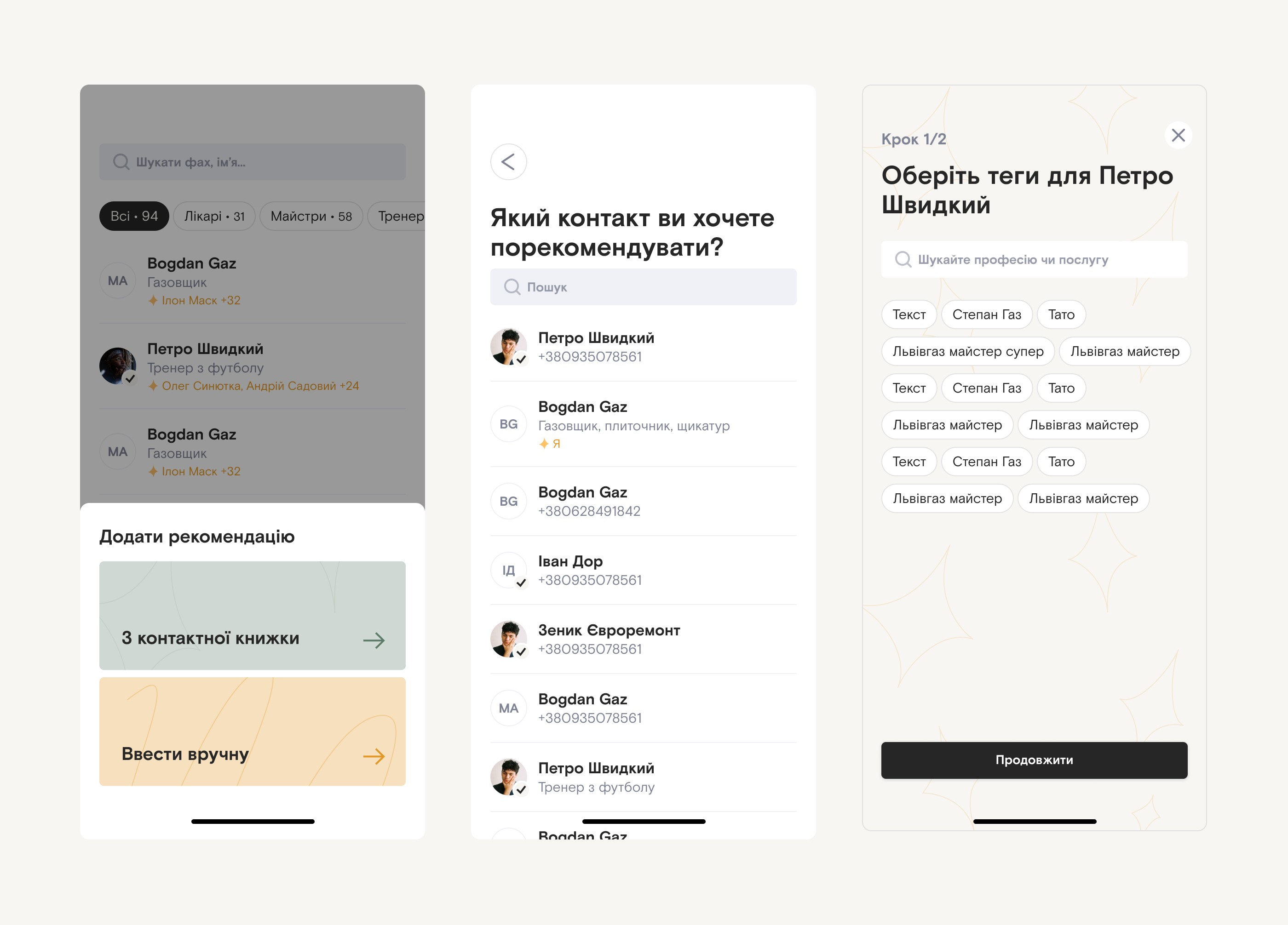
We’ve iterated on this flow a million times already to make it as frictionless as possible. At the time you’re looking at this case study we’ve most likely changed a lot.

Tinder start
Sometimes, we can assume that you have potential recommendation in your contact list. If so, we'll notify you and you can review them
Tinder flow
All of the potential recommendations will be stacked as cards and you can easily swipe left or right to recommend or skip

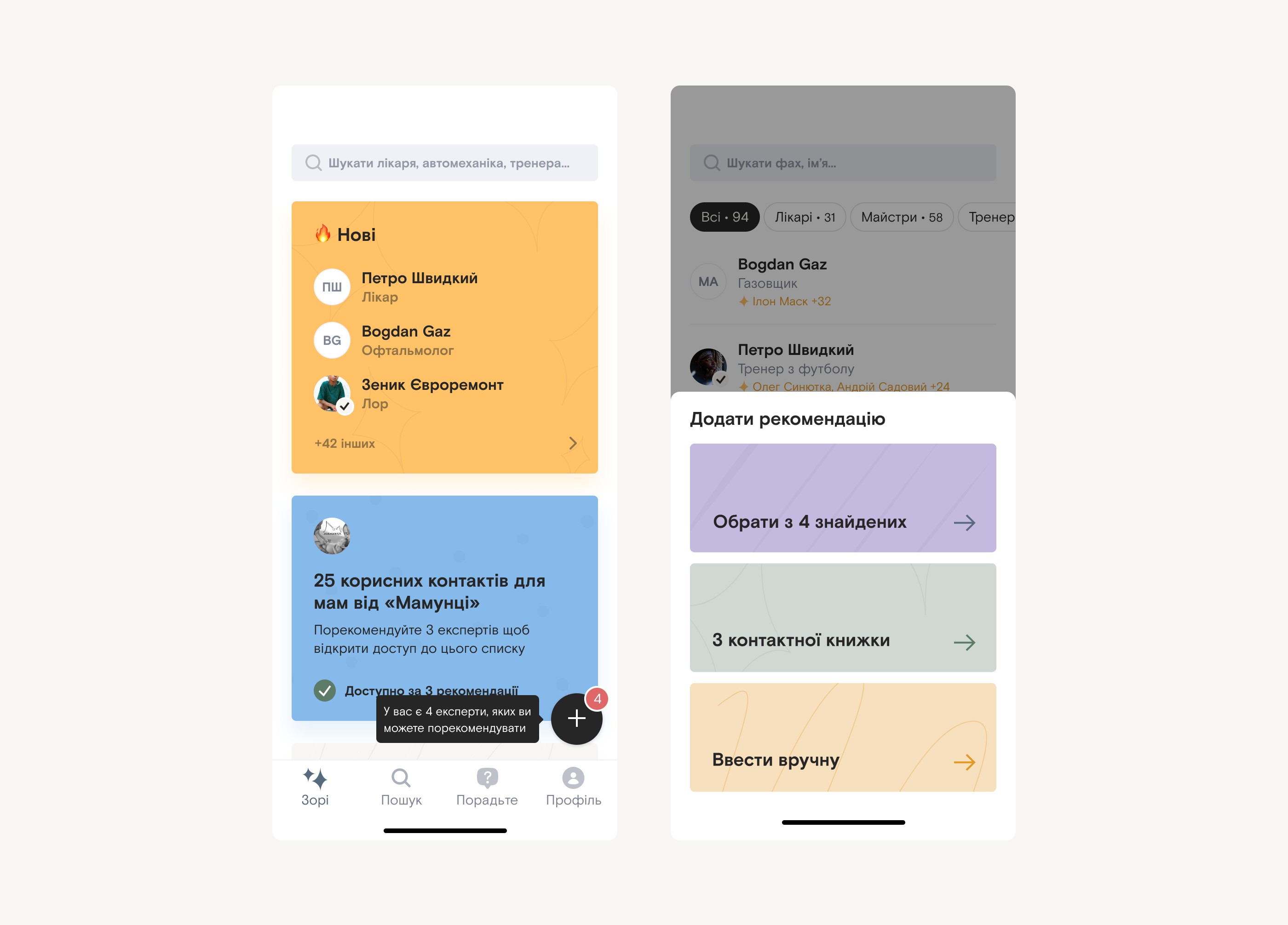
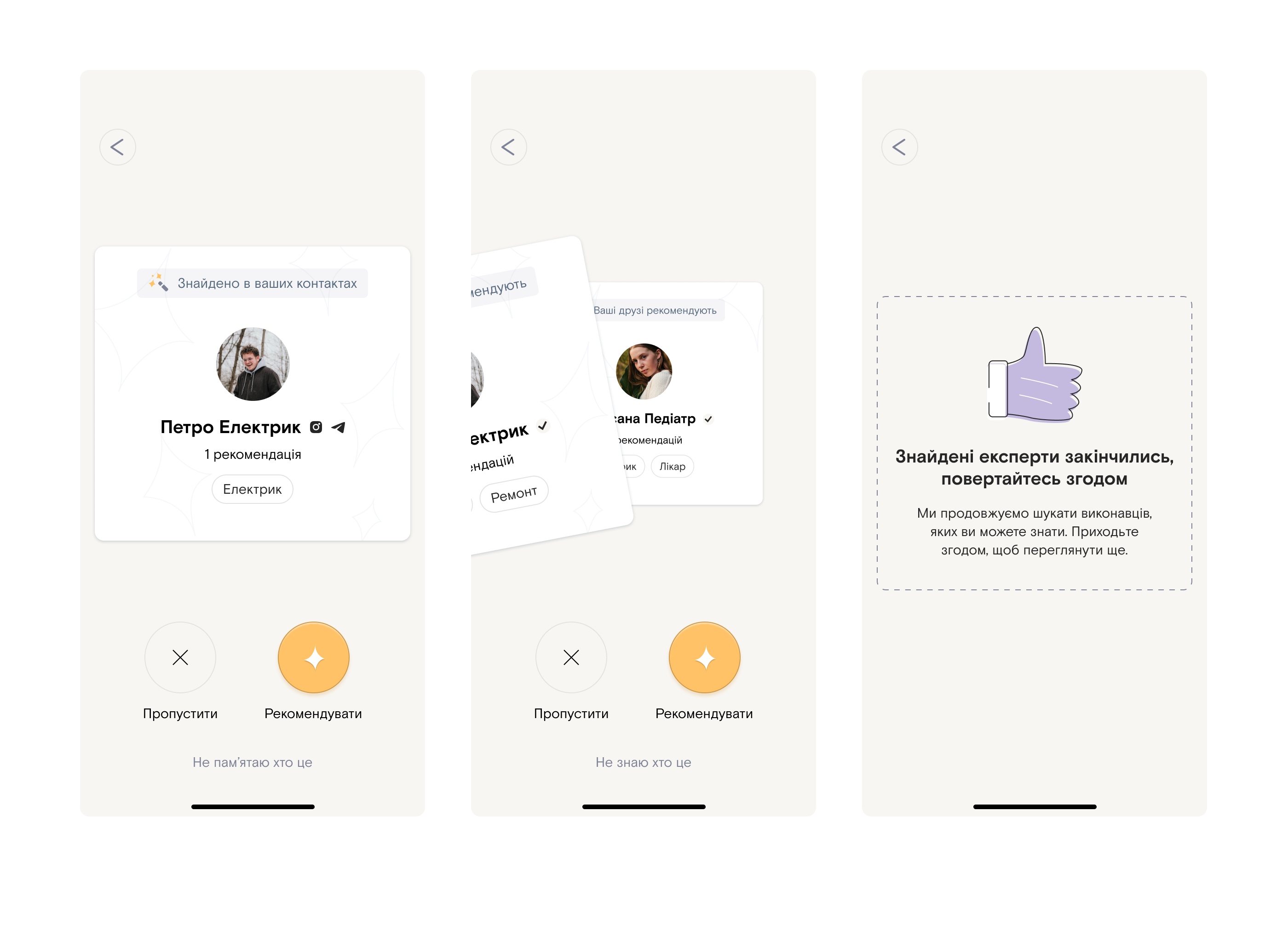
Fun fact, we’re calling this feature “Tinder” internally.

Profile with badges
Some gamification is included to make people more active in the app.
Loader
I've designed and animated a loader for the inevitable cases when we need it
Loader states
No cache / cache
Landing page
It was crucial to explain how the app works very fast. I solved it with an storytelling animation.
Landing page for experts
We have two different landing pages: one for professionals or experts and the other one for users that find and recommend. This is the animation that explains the app for experts.
Profile of an expert on web
To expose the app to more users we've added web share. To see contact info you still need to download the app :)

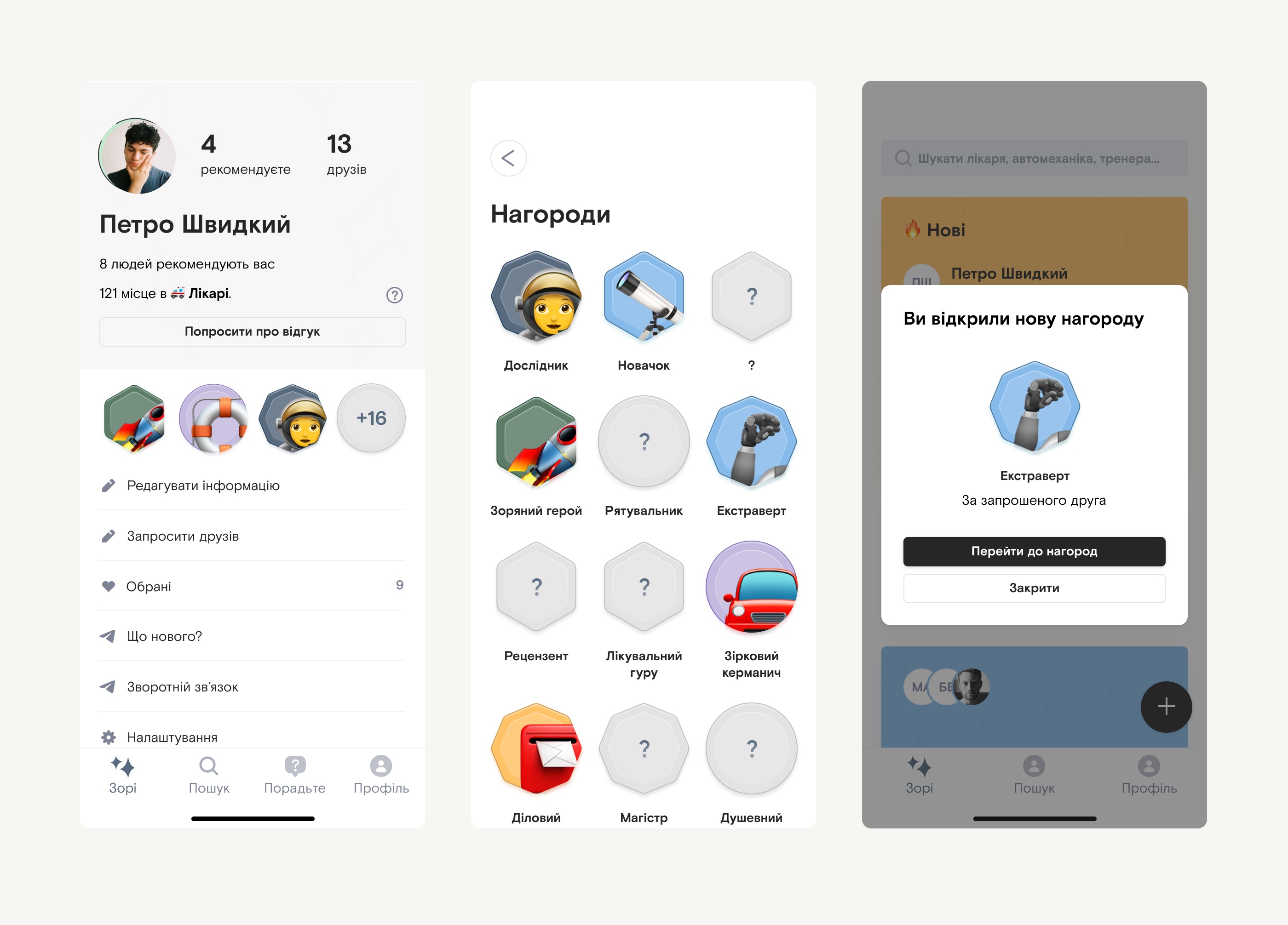
Being the only designer in the team I also designed some misc things

App store screenshots
App store screenshots. We're iterating so much that they've become outdated when Apple finally approved them.
projects icon

Work

about icon

About

lab icon

Lab